Tackling Drawing Dread
darts Learning Program

Product Conceptual Web-based Dashboard
Role Researcher, UX/UI Designer
Timeline 3 weeks
The Background
Why is learning to draw so daunting?
This project began with a mystery: why is learning to draw such a tempting, and yet extremely daunting, task for so many people? Why is it that children can draw so easily, yet adults shy away from attempting even simple doodles? Why do people attempt and then give up?
The Goal
helping people overcome their fears
So many people want to learn to draw, but find themselves barricaded in some way. How can we bring them over that barrier and closer to their goal? How can we keep them moving towards that goal?

How can I develop a flexible and enjoyable product that encourages users to draw regularly and with enthusiasm?
Research Goals
Before diving into solutions, I wanted to get a better sense of what was holding everyone back. Initial surveys showed that a shocking number of respondents expressed a desire to learn but gave up or never attempted to in the first place. It was clear that there was a market need.
Following up on the survey, I decided to conduct user interviews to gain further insights. If the desire to draw is so widespread, maybe there is a unifying factor underneath.

User Interviews
What motivates someone to draw in the first place?


100% of the users interviewed explained that the primary motivation to draw came from their interests. In other words, people are initially intrinsically (or internally) motivated to draw, like a child drawing their favorite cartoon character.
This is a key insight. It shows that users are initially very motivated! At the start, they will work hard and get a lot done. But what happens after that initial motivation wanes?
Why do people give up on their goal to draw?

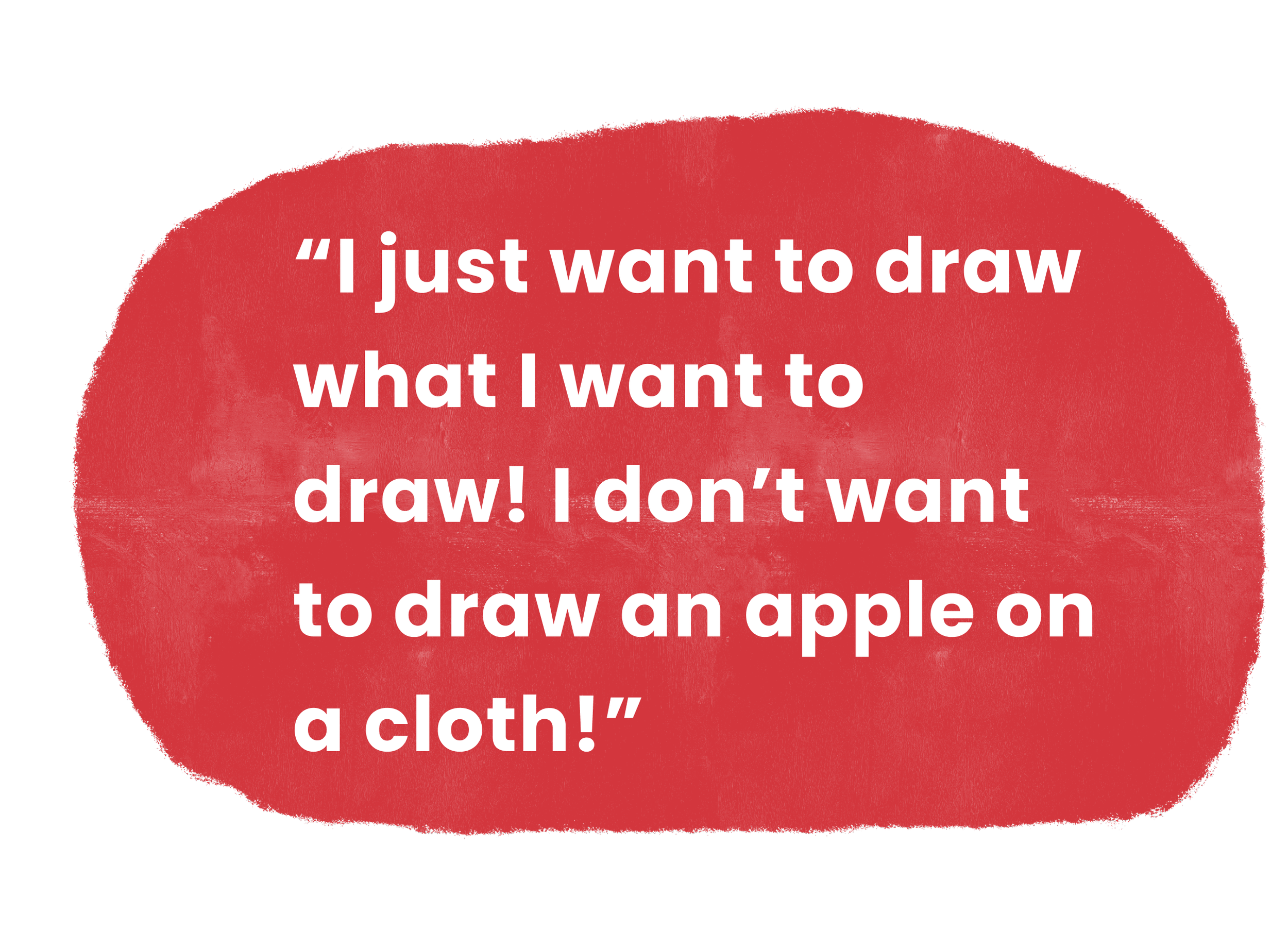
As might be expected, these answers were much more varied. Users mentioned external events like a discouraging art teacher, or internal observations like “Why isn’t my art as good as my friends’?”. A majority of users expressed dissatisfaction with their drawing skill.
One common thread was a resistance to traditional drawing classes. Even if they found them useful in learning basics, most users considered these courses boring and tedious. Users wanted to draw what they were interested in.
What environment is best suited to continual learning?

Additionally, when discussing an ideal digital learning environment, users were quick to speak on what wasn’t working for them. Monetary-based motivation was effective, but typically left users with a bad taste in their mouth (“I have to do it every day because I’ll lose money otherwise”). And streak-based motivation was fun initially, but ended up feeling like a weight hanging over your head (“If I can’t make just one day, all my hard work was for nothing.”)

The insights provided by the user interviews were extremely revealing. Following these talks, I was able to map out user concerns and motivations and then distilled those concerns into a cohesive user persona.
The User
Short-term Motivation, Long-term Stagnation


GOALS
To have the flexibility to pursue personal interests
To improve skills quickly
To share the artistic product with friends & community
FRUSTRATIONS
Being forced along a rigid requirement track
Not seeing personal progress or improvement
Being discouraged by the platform
Top 3 Design Considerations
With these prioritized features at the forefront, I set particular parameters to guide my design process. In order to be successful and appeal to the user, the product would have to be the following:
Flexible
Users can access any course in any order. No need to start with lesson 1 in order to proceed.

Motivational
The structure of the course and the features of the app should be encouraging and goal-oriented.

Fun
The language used throughout the app as well as the design system itself should promote an atmosphere of casual fun.

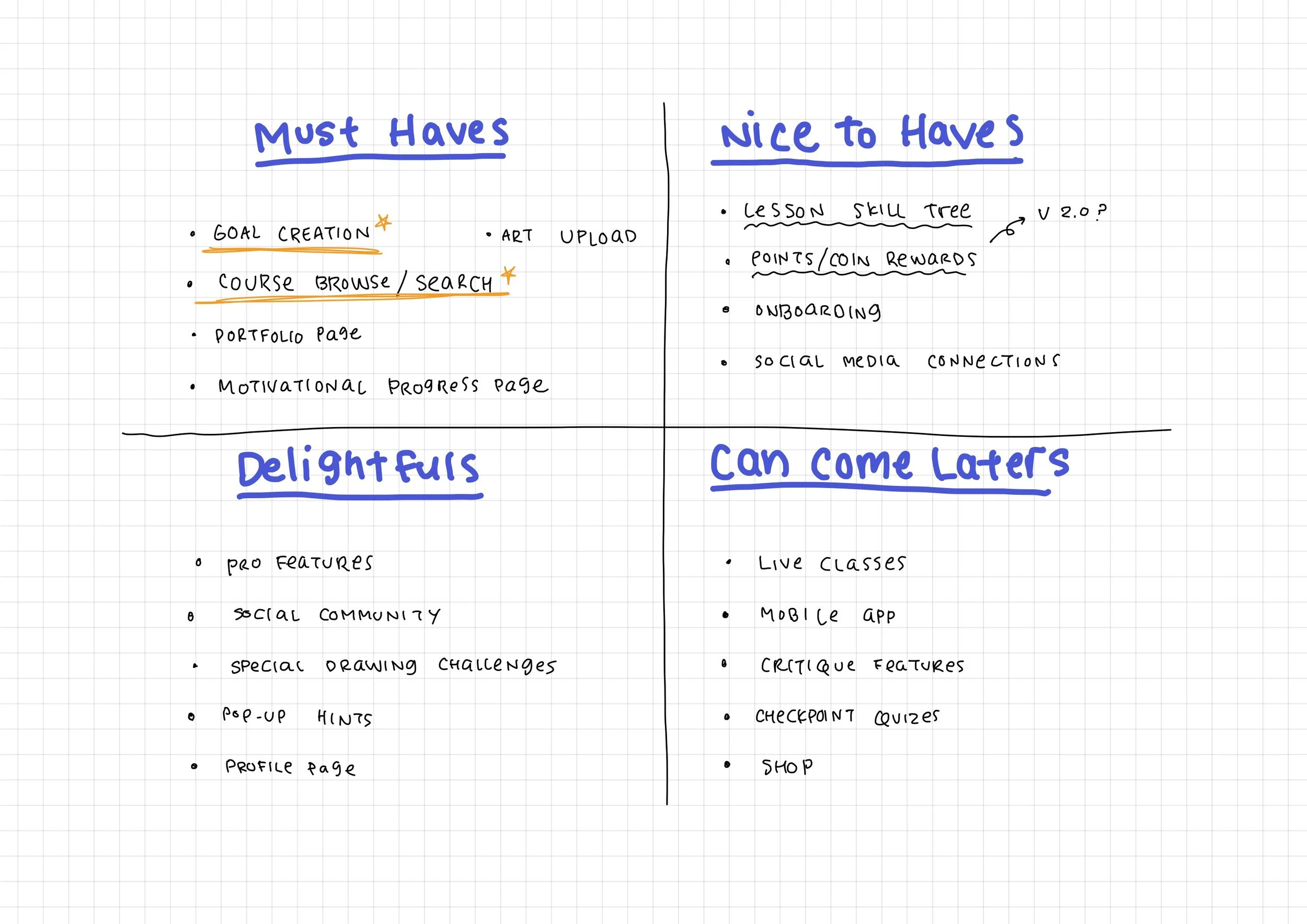
Brainstorming an abundance of ideas made prioritization a challenge. Keeping the user persona’s needs in mind, I used an impact effort matrix to categorize features into four categories. The limited scope and tight deadline of the project restricted the initial development to high-priority features only.
Two main features occupied the core of the project:
The Fundamental Features Have Priority
Ideation
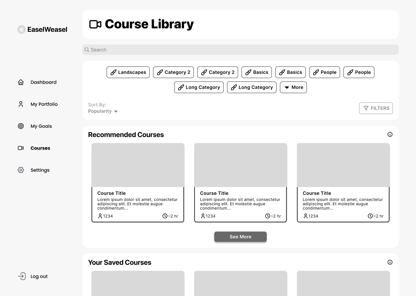
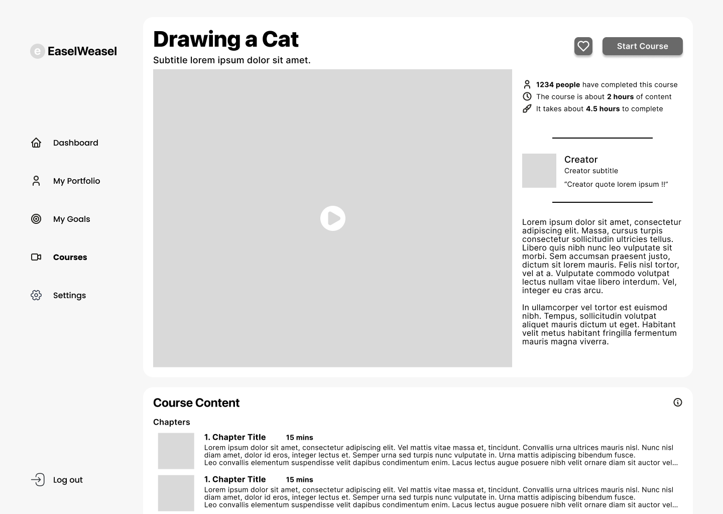
The first and highest priority task was having the user search for, select, and join a course. In this case, that course was learning to draw the superior pet: the feline.
I want to learn how to draw a cat!
Feature One: Course Access

Initial Wireframes
I want to draw for 15 minutes a day, twice a week!
Feature 2: Goal Setting
The second highest priority task was having the user set a goal for themselves. The key here was to encourage reliable goal setting (goals that were achievable, measurable, etc.) but also allow enough flexibility for the user to set customized goals.

Initial Low-Fidelity Designs

Accomplishing Goals as Smoothly & Easily as Possible
Usability Testing & Iteration
Usability testing was performed following the above tasks: “search for and enroll in a course” and “add a new goal to draw regularly”.
Users responded well to the task flows and were able to complete the tasks without any outside assistance.
All users compared Darts favorably to other educational dashboards.
Users responded well to the design layout overall.
Many users indicated that they would use a product like this in the future
Easing Confusion & Unifying Brand
Iterations
Personal/Inward tools such as “My Portfolio” and “My Courses” are grouped separately form Public/Outward resources such as “Explore Courses”. Under-the-hood tools such as “Settings” are put at a distance.
Compartmentalize the Side Menu
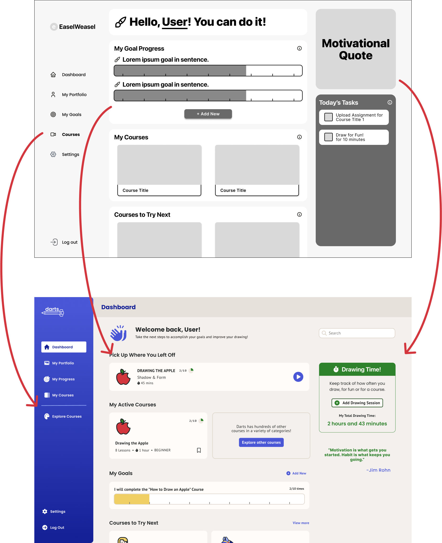
Prioritize the Dashboard
In response to user testing, the dashboard hierarchy was shifted to prioritize active courses. Background activities such as current goals are moved further down the dashboard.
Today’s Tasks Back to the Drawing Board
Users were confused as to the purpose of the task list. Rather than a running to-do list, a simple reminder at the top of the page shows users where they left off.

Condensing the Filter & Search
A bulky filter block at the top of the course library distracted users from potential courses. Popular tags are hidden behind a filter menu so users can see more potentially interesting courses as quickly as possible.
Course cards were redesigned to include more course-related information, such as number of lessons and level. Users can now save courses that appeal to them.
Concise Course Card
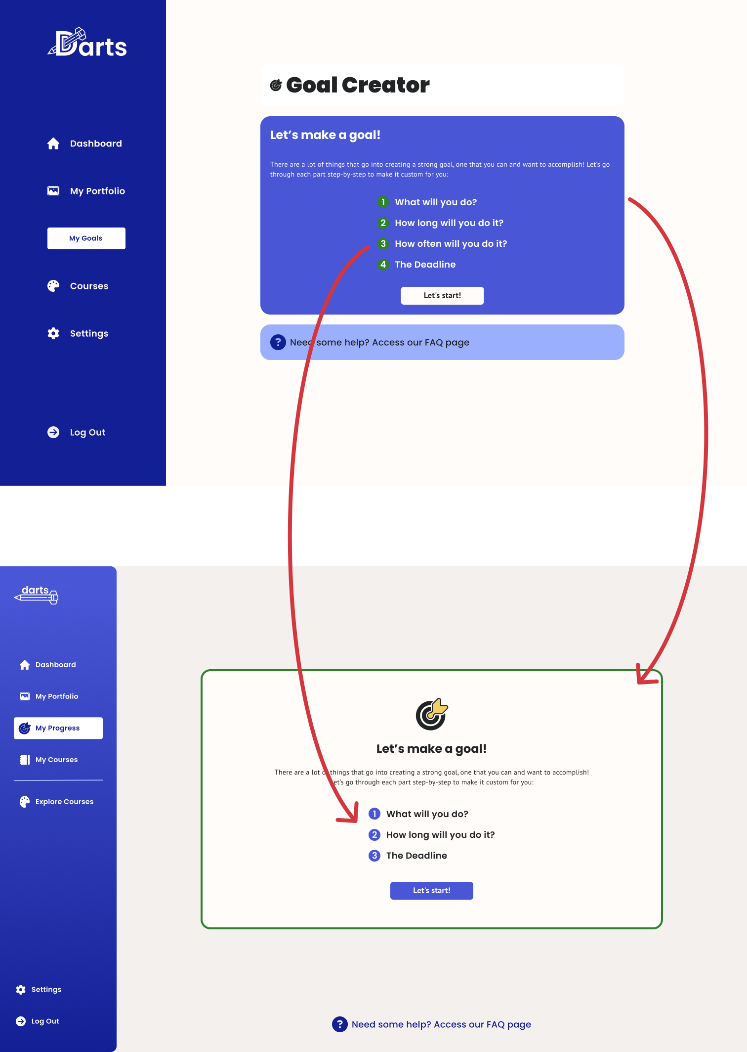
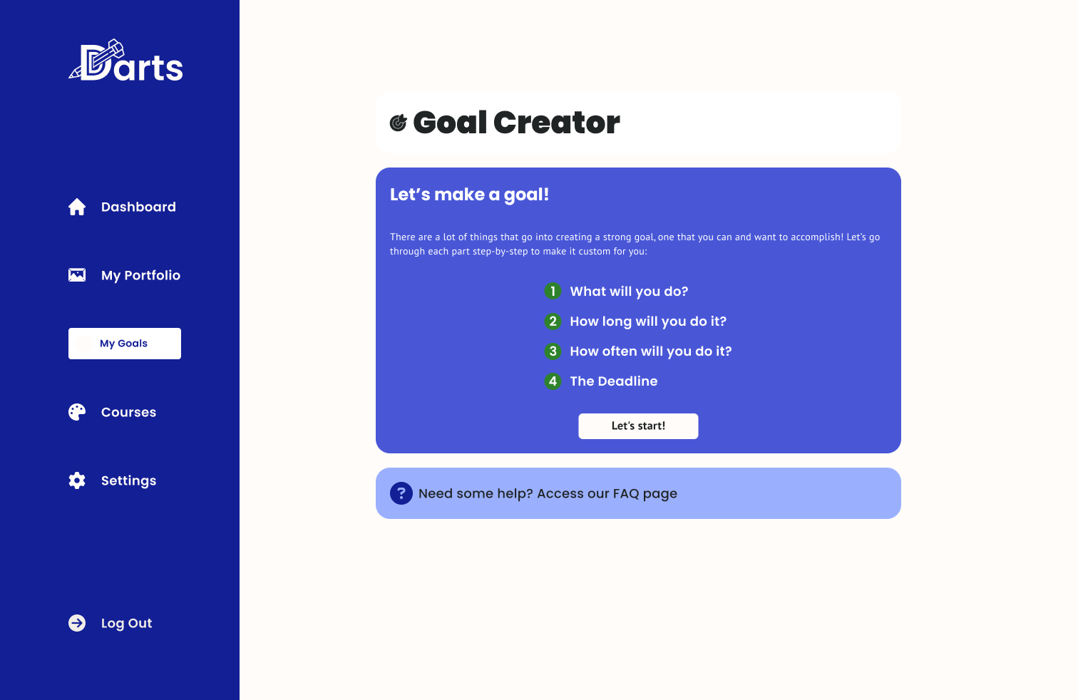
The small dark Goal Creator seemed cramped and intimidating. Brightening the colors and creating a more airy interface improved the experience.
Brightening the Experience
Consolidating the Process
Users indicated slight confusion in differentiating between length of time and frequency. The final version consolidated the two steps into one.
Next Steps
When reflecting on this project, I think Darts fills a much-needed niche as not just a drawing platform, but a motivational, educational platform. As more and more users move from traditional in-person lessons to remote learning, they will expect an up-to-date and easy to use product that satisfies both the need for good quality lessons as well as a smooth and encouraging platform.
Darts has a lot of room to grow. As it stands, the next opportunity lies within gamification and a reward system. A significant number of users indicated an expectation for coins or points received following accomplishments of tasks. This can further solidify this product’s potential in the growing field of education technology.