Improving the Ordering Experience for a Local Coffee Shop
Tōv Coffee Takeout App
Figma

2 Weeks
Conceptual App Design
UI/UX Design

Tōv Coffee & Tea Offerings
The Client & Product Background
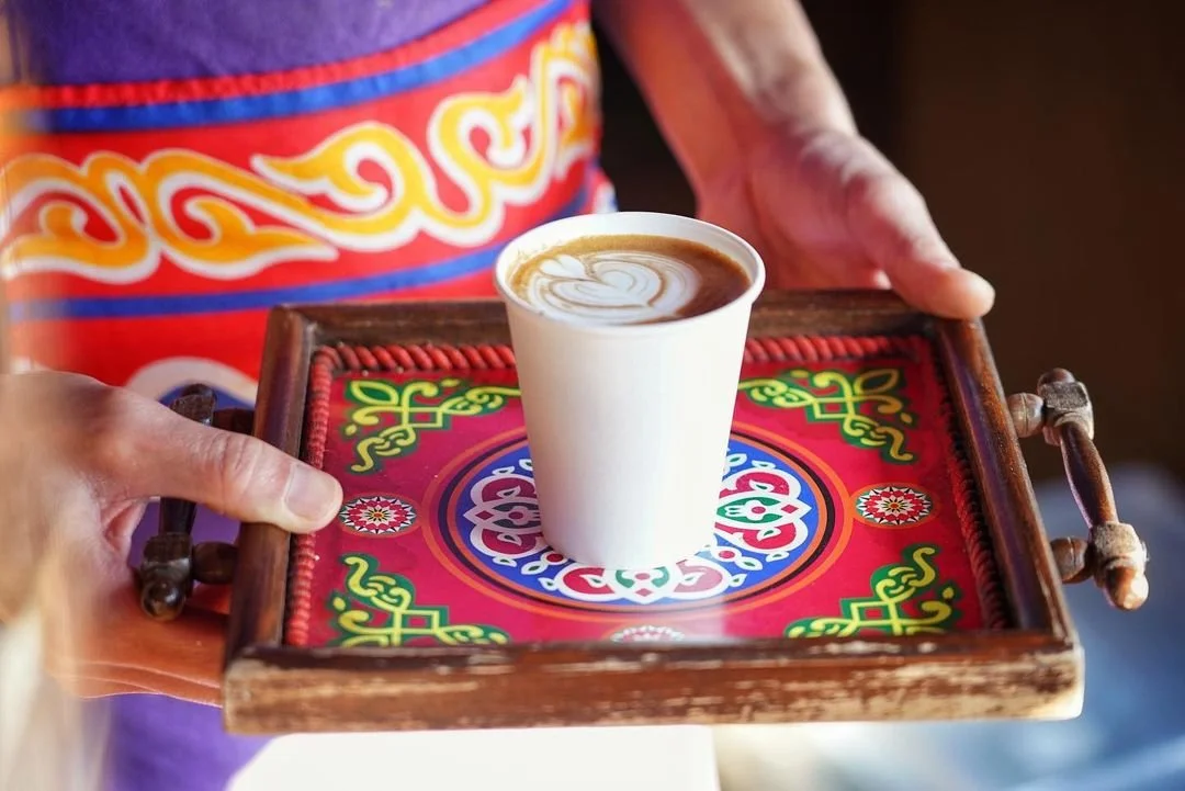
Tōv Coffee is a coffee and tea shop operating out of a double-decker bus in the Hawthorne district of Portland. The first-floor kitchen and second-floor lounge area provide a unique coffee experience, perfectly reflecting the Portland atmosphere.
Tōv serves traditional Egyptian coffee with unique flavors like mint, pistachio, cardamom, and rose. Pair a traditionally-brewed coffee made using a cezve in sand with a pistachio rose water cookie!
Limited Ways to Support a Local Favorite
The Problem
Currently, Tōv customers have no way to interact with the local shop beyond visiting the store in person. Further, due to popularity and limited space within the bus, customers can often wait up to an hour for their orders.
Increase Checkout Speed
Project Goals

The wait time for Tōv is a concern for both customers and stakeholders. It’s important to address this concern in design decisions.
Maintain Brand Presence
Users are attached to the local, independent nature of Tōv. Maintaining that brand presence throughout the solution and setting the solution apart from competitors will be key.

Competitive Research
Menu Selection & Checkout Flow are Critical
With checkout speed being a major goal of this project, research was largely concerned with how best to produce the menu selection and checkout flow. An ideal situation sees users proceeding through this product smoothly and efficiently. How have other applications catered to this task flow and can we apply those solutions to this situation? Following a recognizable pattern of design was important here, as it allows users to flow through a familiar series of steps with speed and confidence.
Research Results
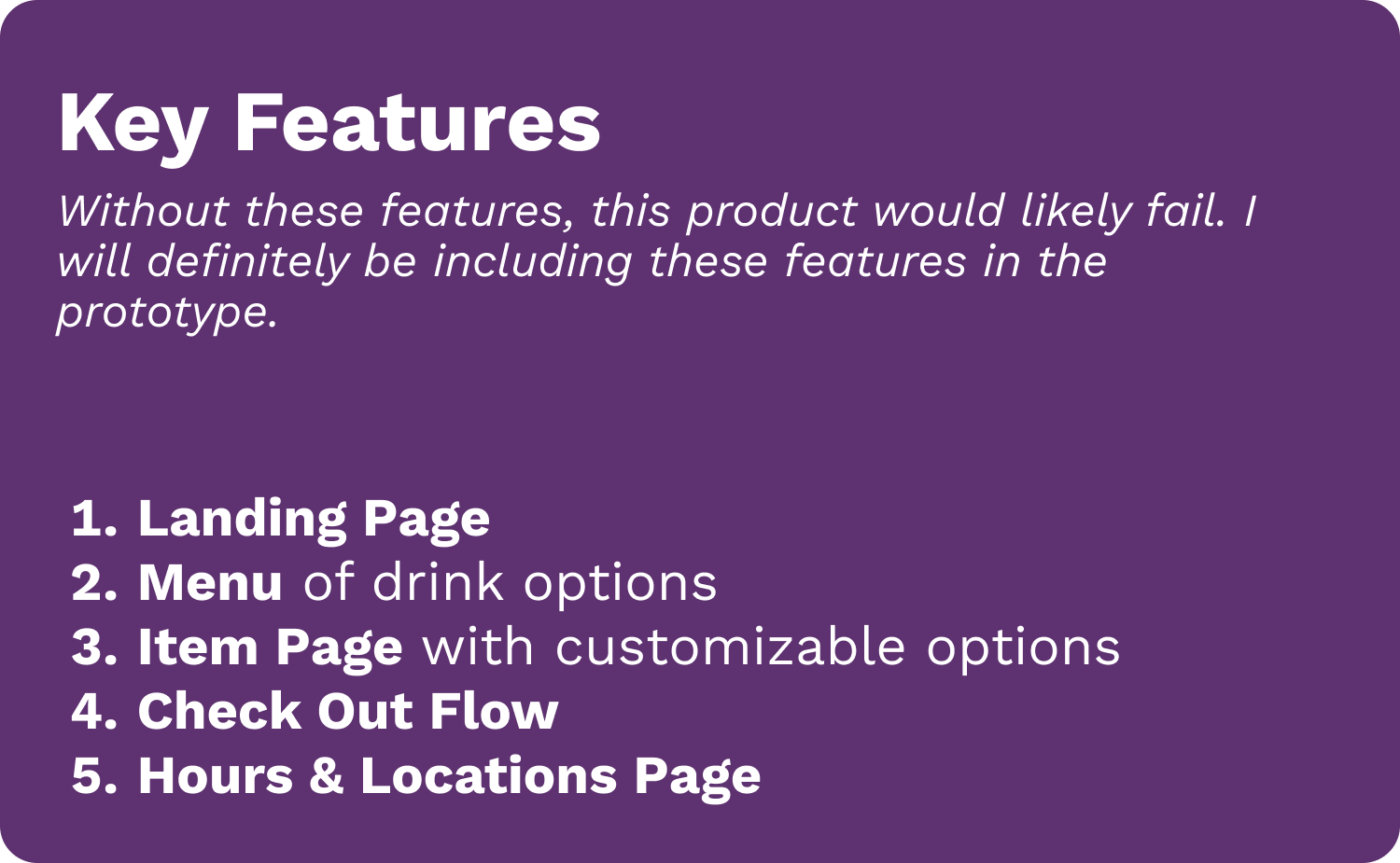
The Key Features
Other mobile takeout apps were extremely helpful in highlighting the key elements needed for a smooth checkout experience. These included:
A Landing Page
A Menu
An Individual Item Page
A Drink Customization Flow
A Checkout Flow
Hours & Location
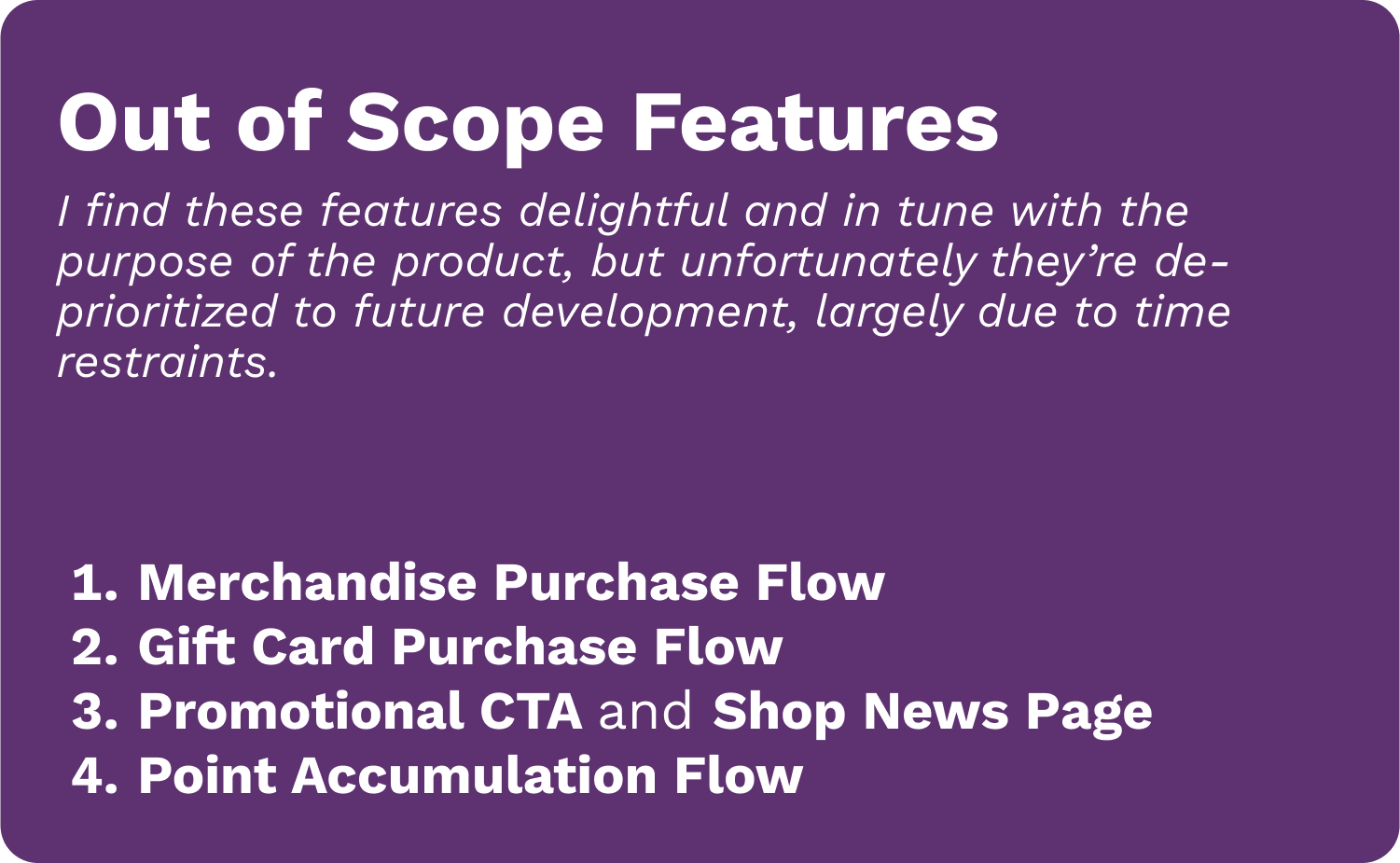
Merchandise Purchase Flow
Gift Card Purchase Flow
Promotional CTAs & Shop News Page
Point Accumulation Flow
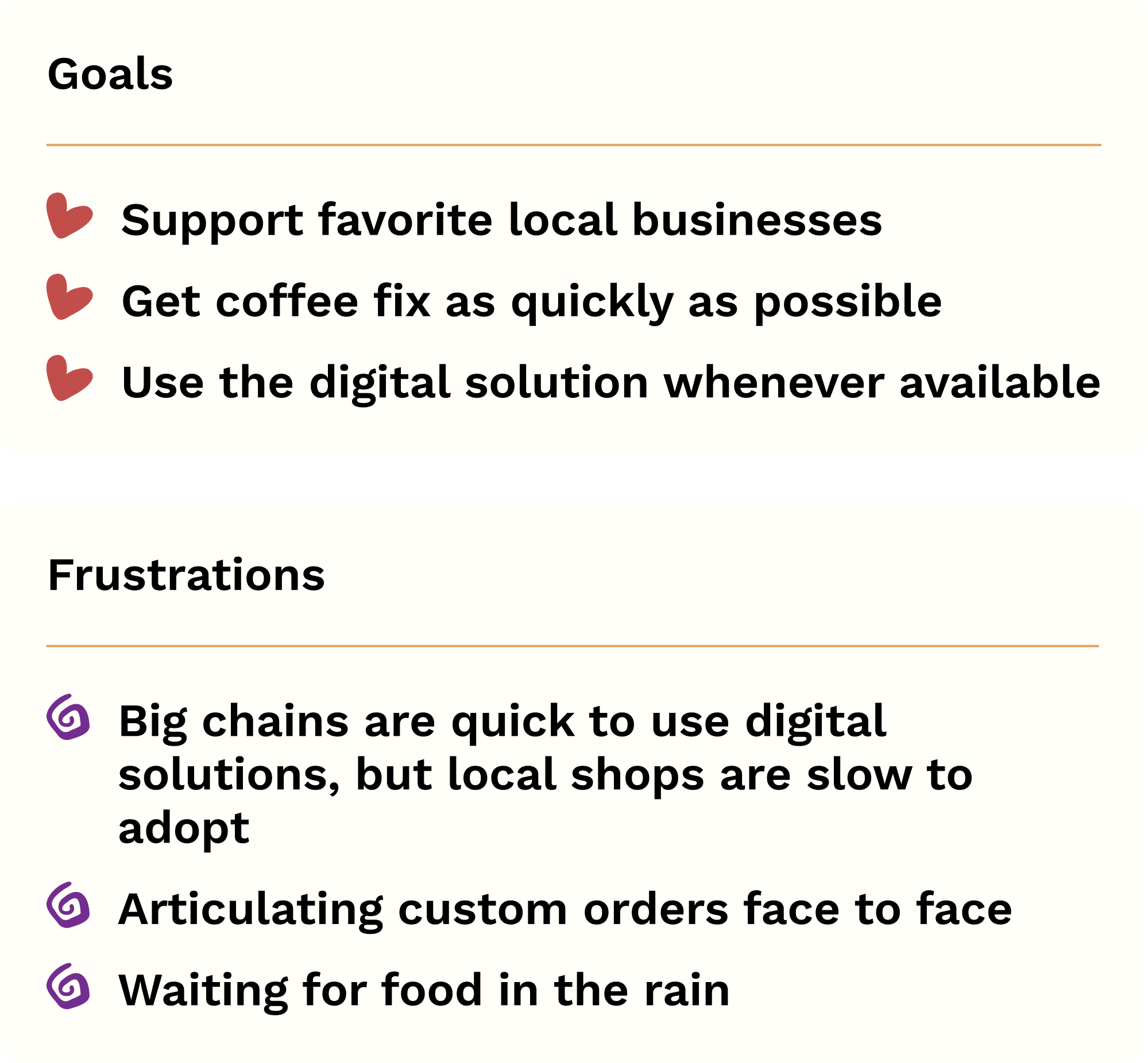
Tech-Savvy Local Enthusiast
The User

Feature Prioritization
Determining the MVP of Features
After considering the research and the needs of the user in this particular situation, and understanding the limitations of a 2 week timeline, I developed a list of features and used an impact/effort matrix to sort them into two main categories.
Wireframes
Getting an Idea of the Flow
With direction and prioritization decided, I quickly began work on sketching out ideas and producing wireframes. This allowed me to share bare prototypes and gain some valuable usability data.
Quick “Order Now” Button
For either first-time users or users who want to begin the ordering process as soon as possible, a large button allows for a quick start. Users can also begin the process through the Menu in the bottom bar.
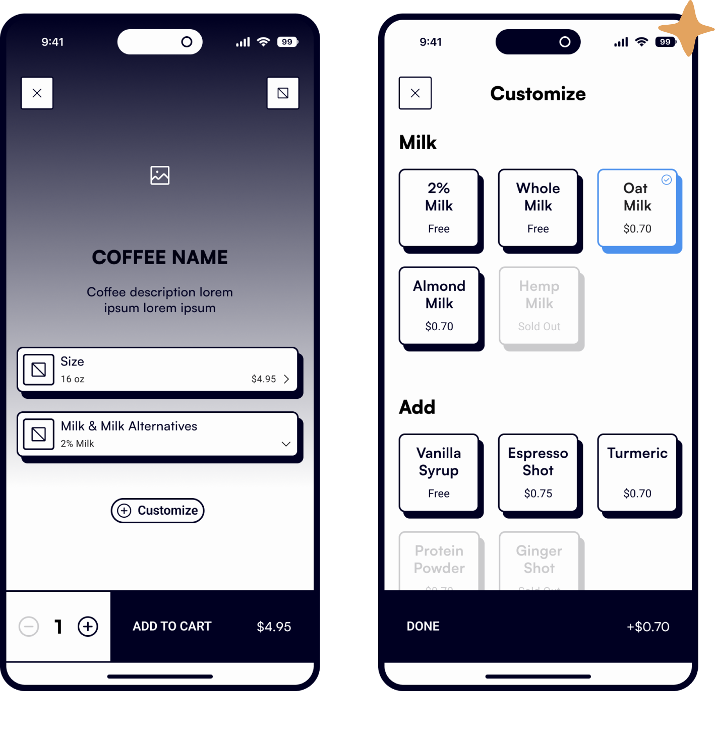
Customization Menu
A customization menu allows users to see available options and make a selection without a stressful face-to-face interaction.
Branding & Design System
Unique Features Brought Forward
Tōv Coffee already has a strong logo and brand personality. My challenge this time was to wrangle that style and translate it into a design system that would be accessible and readable, but still show the unique and fun atmosphere of the Tōv Coffee Bus.
Vibrant Color
Using Texture to Express Personality

Most coffee take-out apps utilize a modern and minimal design. Tōv Coffee is simply not a minimal brand, as one look into the interior of the bus will reveal. This beautiful maximalist texture was integrated into certain areas of the app design. This helped retain that sense of personality without compromising the usability of the app.
And a Familiar Character
To further emphasize the Tōv brand, and to remind digital users of the unique setting of the shop, I utilized this double-decker bus icon and placed it in a few areas around the app. It does little in terms of app utility, but I hope users get a kick out of it!

Usability Testing
Usability tests were performed, with focus on user speed and finding any points of hesitation or confusion. Results found that users spent more time on the separate page-style customization menu than the drop-style.
What Slows You Down?

Improving Flow for Speed & Beauty
Iterations
After usability testing with the prototype, users found areas that could be improved. Namely, the flow could be faster and more efficient, especially accounting for the speed user above. Additionally, while the first prototype had the quintessential Tōv purple, it still had the feeling of being black and white and minimal.
Final Prototype
Once the main iterations were complete and users were able to smoothly and quickly order their desired beverage, the final prototype was put into production. Animations gave users a tangible sense of app-generated feedback in addition to providing another stage for the Tōv bus to shine.
Click here to try the interactive prototype!
Implementing Multidirectional Usability
Takeaways & Next Steps
Now that the product’s basic function (ordering a coffee) has been smoothly demonstrated, I am excited to continue working on this project and to see what other features can be included. Features put on my dream-feature list, such as a point accumulation system or a way for users to buy canned drinks and merchandise, are a start!
Additionally, I’m curious as to how this product will perform under extensive testing and with edge cases. How can we make the checkout flow that much more efficient? How can we incorporate further customizations?
Finally, with a customer-facing product such as this, you must consider what the coffee shop-facing product might look like as well. How does the barista register and confirm orders? How can they communicate with a customer if there is a delay? If development were to continue on this product, the first thing to consider would be the shop companion!